- News
Eallin’s new visual identity.
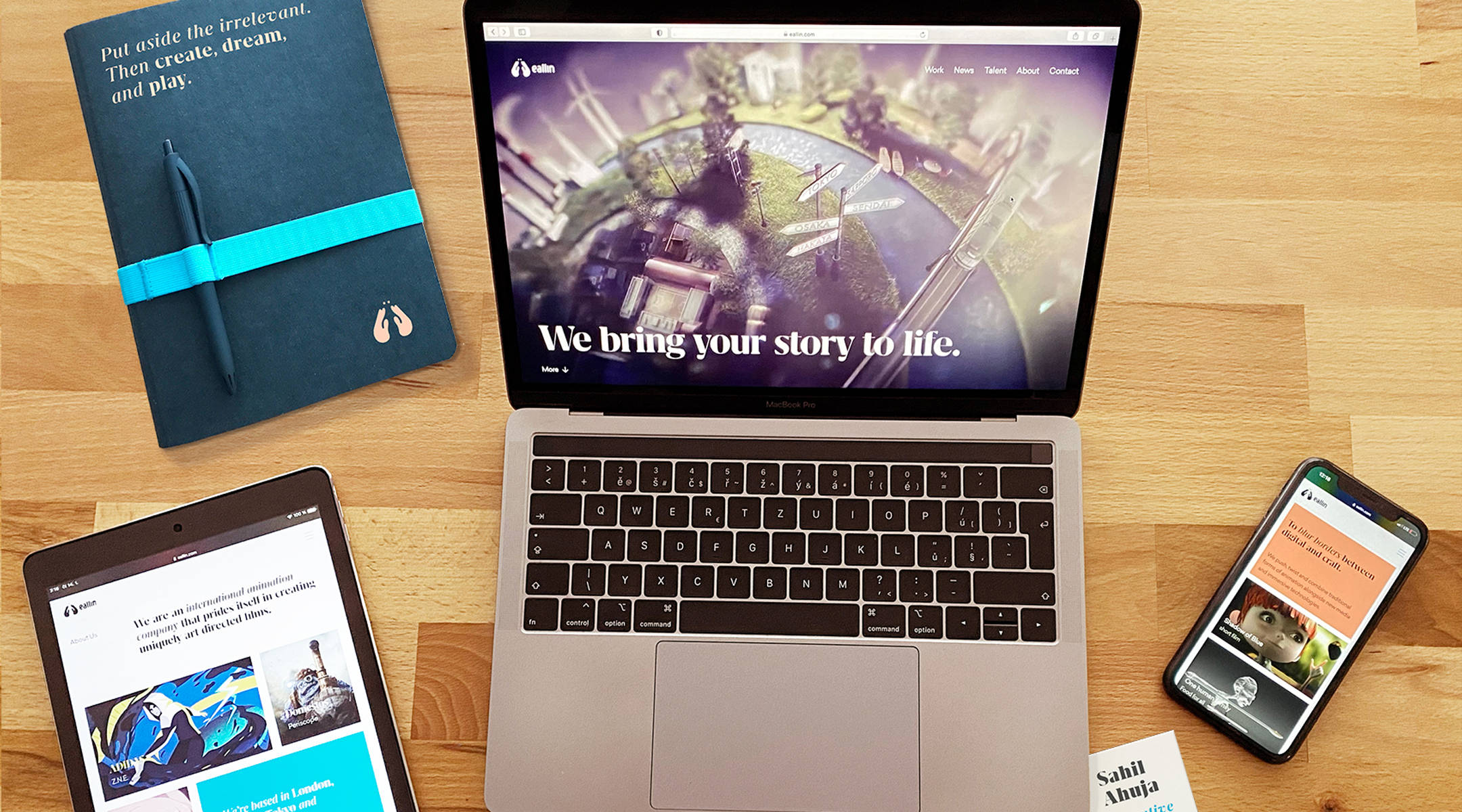
A silver lining to 2020 that many of us shared, was the chance for some introspection.
As we observed ourselves in the mirror, we felt that our look no longer served our aesthetic and functional needs. Long story short, we thought we wanted a haircut, and ended up in plastic surgery – from our brand colors, to our fonts, and layouts – the whole ensemble needed change. So here goes, we’re launching our new visual identity!
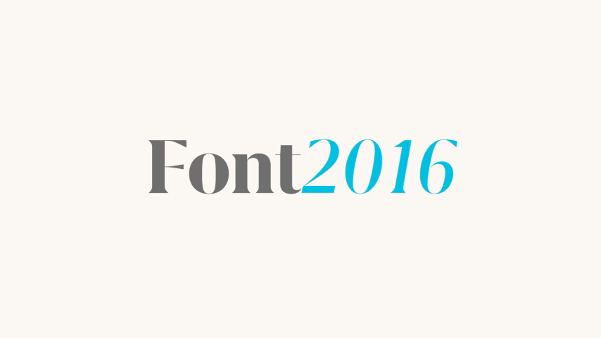
Typography
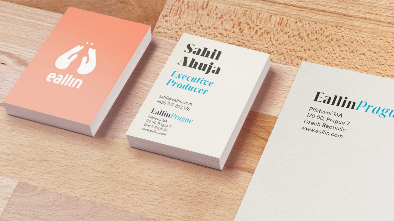
It all starts on the page, so let’s begin with our new choice of typography. The intensely high stroke contrast of Grifo L helps develop a unique, expressive brand personality.
As our headline font, we felt that it represented our approach to creating animated films due to the playfulness, and freedom that the bold and italic versions allow.
The Grifo L is then supported with the clean, geometrical Sailec as our body font, resulting in a combination that personifies the latest Eallin.
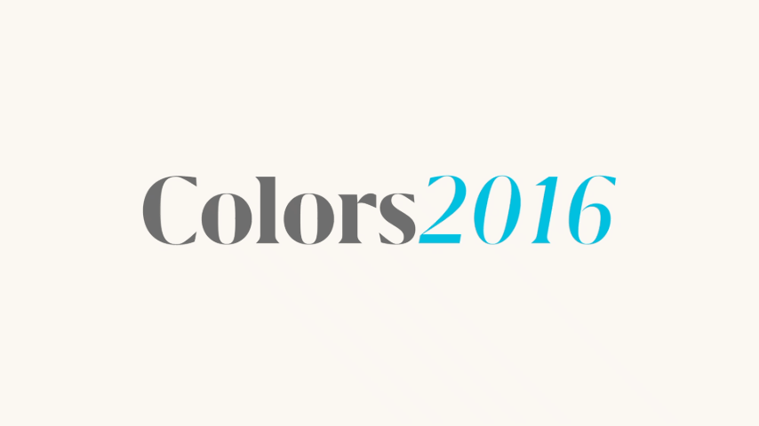
Color palette
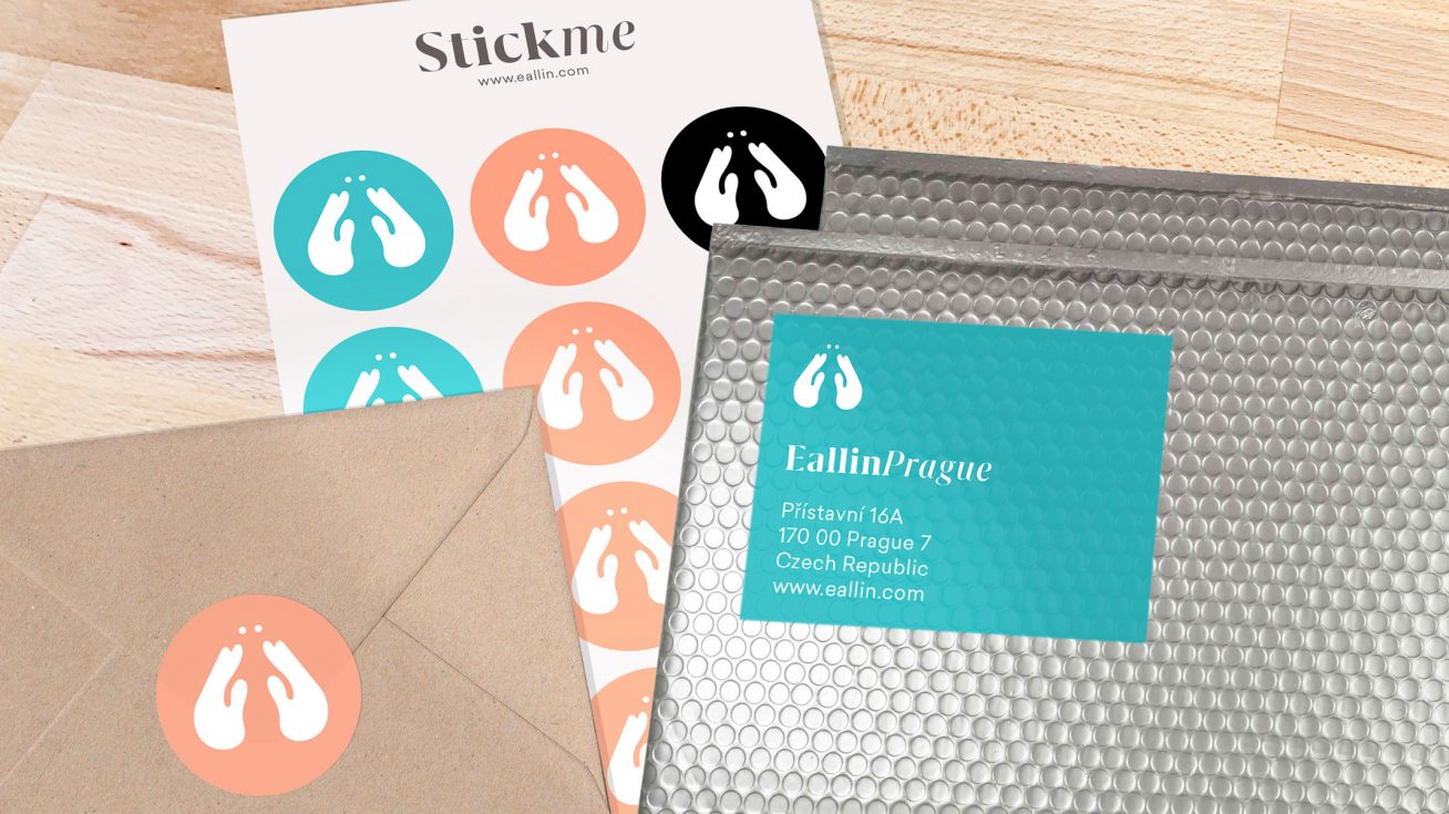
The new color palette consists of a bright azure blue and apricot orange, balanced with the versatile black and white. The dynamic color mix is instantly recognisable, vibrant, but also ownable and trustworthy, underlying our brand’s premium offering.
“I aimed to create a versatile identity that feels unique and authentic, yet not overpowering, as the work showcase should still be in the spotlight. We achieved this by choosing a distinctive typographic family, complemented with a crisp color palette and a unique layout.”
Michaela Fiasová
designer
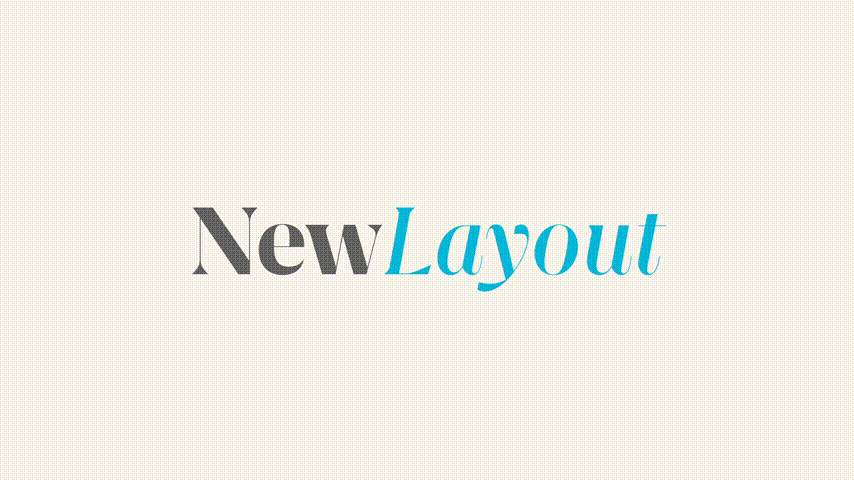
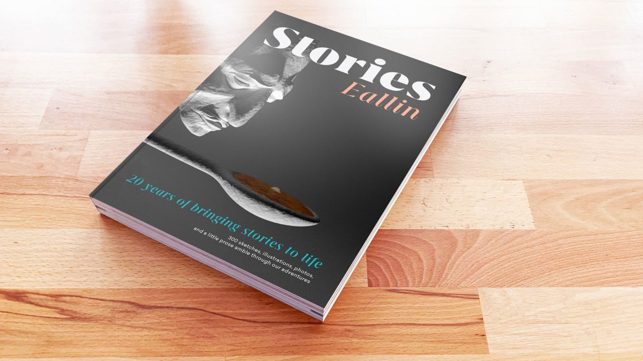
Layouts

The new design is more flexible to our needs of telling various stories about our projects, and with the website content now having much more room to breathe, the overall changes in the visual identity allow our projects to stand out and be more visible.
“We wanted to bring Eallin alive through their own identity that would better represent their global outlook and focus on quality and innovation.“
Michaela Fiasová
designer

Recent news
- News
Presenting – everfresh
We are delighted to present the German audio-visual artist, Sebastian Pfeifer, the latest addition to our roster.
- News
Carlos Lascano: “You can change your reality through perception.”
Read about the multidisciplinary artist from Argentina in our interview.
- News
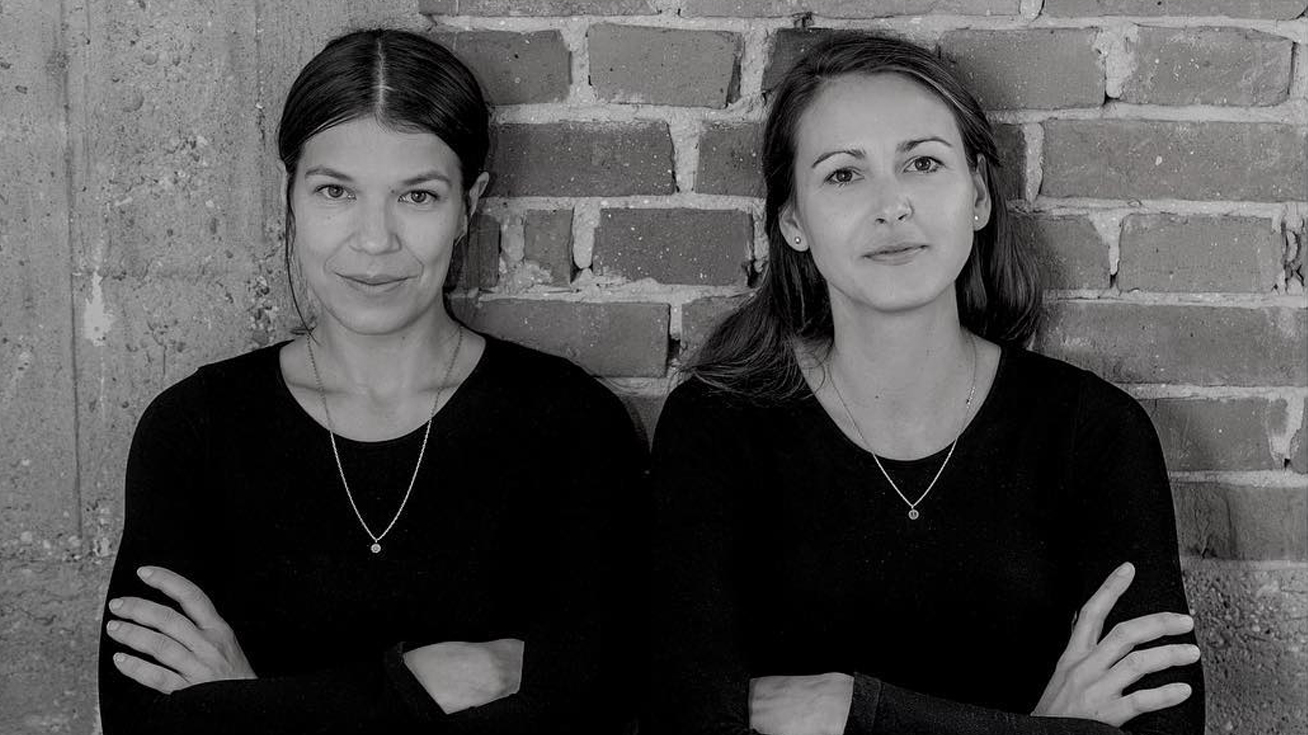
Presenting – Ové Pictures
Original art style and sophisticated craft technique is what comes from the relation of the two artists – Michaela Čopíková and Veronika Obertová, who create under the name Ové Pictures.